Tracking key performance indicators is an unavoidable activity of a project manager. Depending on the industry and method of executing assignments, KPI's may vary. However, many of the tools for measuring them are similar, although they are adapted to the specific case.
Such a tool is the scatterplot chart. It has found its way into the lives of countless managers and has been adapted for various purposes, including measuring and forecasting the cycle time of assignments.
What Is a Cycle Time Scatter Plot?
The cycle time scatterplot is an adapted version of the well-known chart. It is revered in the Lean management world because it provides a detailed picture of one of the key metrics in Lean: cycle time.
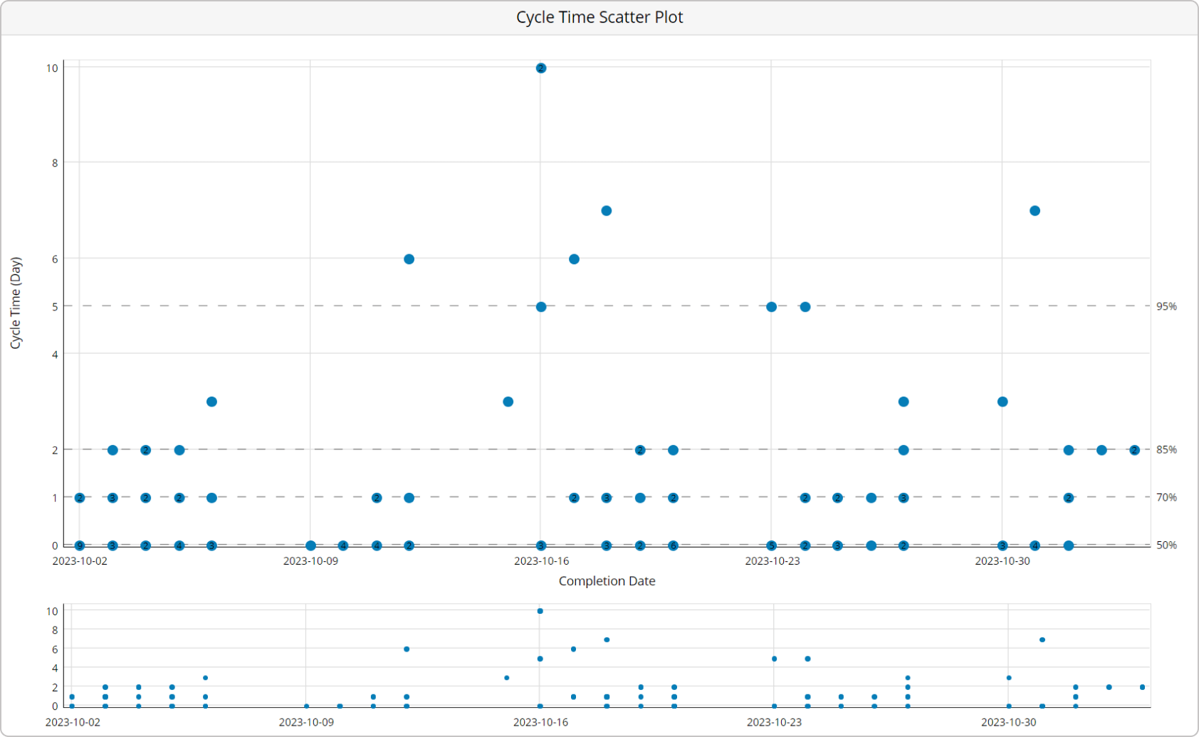
Cycle time represents how long it takes to get things done for individual items on your kanban boards. The goal of a cycle time scatterplot is to visualize the cycle time of your team's assignments within a predefined time frame. The chart's structure is very similar to that of a typical scatterplot. The horizontal axis visualizes a selected time frame by dates. The vertical axis represents the cycle time of the completed work items during this period, calculated in days.
Each dot that you see scattered across the chart is a marker representing a task within a card on your kanban board. The dots' positions are determined by the date of completion and how long it takes for the kanban card to reach the done column.
Lean leaders may use the cycle time scatterplot to:
- Visualize clearly the cycle times of multiple assignments of the same type
- Compare how much time different work types take by coloring the dots of each one in a distinguishable color
- Forecast the cycle time on future assignments
How to Use a Scatterplot Chart to Forecast Cycle Time?
One of the greatest benefits of using a cycle time scatterplot in Lean management is that it enables you to forecast the outcomes of future tasks. Although it may look confusing at first sight, the chart can give you probabilistic forecasts about future performance.
For this to happen, you need to draw horizontal lines across the chart, depending on the number of finished tasks within a specific time frame.
For example, let's say you have 100 tasks completed in 30 days. If 25 of them were finished in 5 days or less, while all the others took longer, you've got a 25 percent chance of finishing any future task within this time frame. Draw a horizontal line at the height of the 10th day on your cycle time scatterplot.
Let's say 50 more tasks were completed within 10 days. The second horizontal line should mark 75 percent and be at the height of the 10th day. The higher the percentile, the higher the chance of completing a future task within this time frame.
Whenever you commit to a deadline, you need to look at the percentile lines on your scatterplot and say that you've got a certain percent chance to be ready in X days/weeks/months.
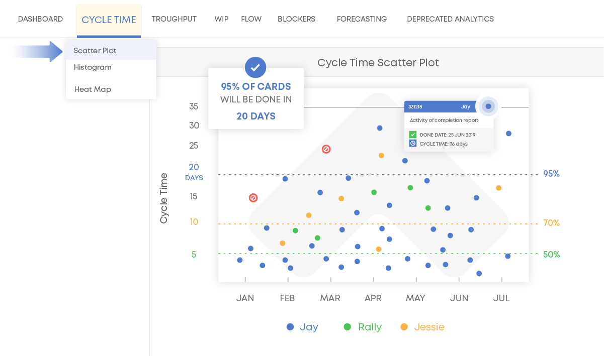
Undoubtedly useful, a handmade cycle time scatterplot would require a lot of time to maintain. Thankfully, some digital kanban board platforms offer cycle time charts as a built-in functionality. With their help, you can set the desired time frame and get accurate data and percentiles in a few seconds.
You also have several filters available to help you easily distinguish among card criteria such as task type, priority, assignee, etc. This way, you can visualize the exact data you are looking for with great precision.
The cycle time scatterplot is a valuable addition to the analytics arsenal for Lean project management, integrated into the Businessmap platform. With its help, you can get a clear view of the cycle time for work that passes through your team's kanban board. You'll also be able to forecast how long it will take for future assignments to be completed.
Businessmap is the most flexible software
to gain full work visibility across teams & portfolios
In Summary
The cycle time scatterplot is one of the most advanced analytics for Lean project management. The chart:
- Presents clear visualization of the cycle times of multiple similar assignments
- Compares the performance of different work item types by coloring the dots of each one in a distinguishable color
- Provides an easy way to forecast the cycle time of future work items


 The chart's structure is very similar to that of a typical scatterplot. The horizontal axis visualizes a selected time frame by dates. The vertical axis represents the cycle time of the completed work items during this period, calculated in days.