Key Takeaways
- A Pareto Chart is a prioritization tool built on the 80/20 rule.
- It highlights the "vital few" problems causing most of the pain.
- Always order categories from largest to smallest impact.
-
The result: faster improvements, higher impact, less wasted effort.
What Is a Pareto Chart?
A Pareto Chart is a problem-solving tool that helps you see which issues are worth your attention first. It's built like a bar chart but sorted from the biggest to smallest contributors, left to right. On top, a cumulative percentage line shows how much of the problem is explained as you move across the categories.
Think of it as a visual way to apply the 80/20 rule - where 80% of the effects come from 20% of the causes. The chart points you to the "vital few" problems that, if solved, will make the biggest difference.
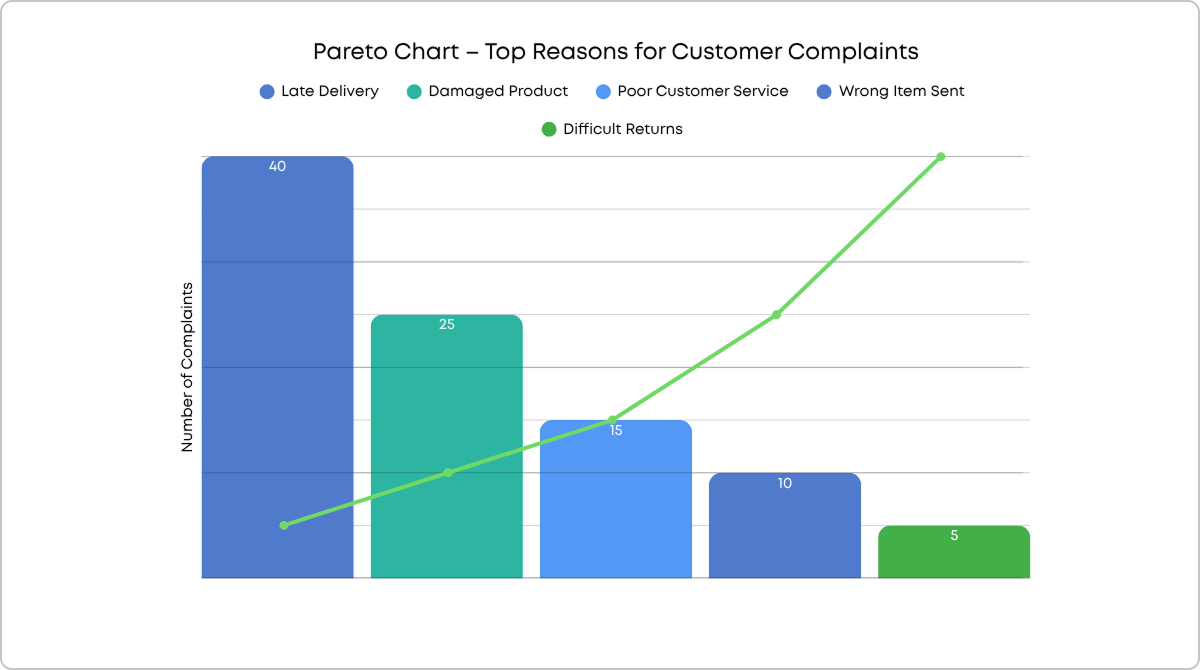
 Visualizing the top reasons for customer complaints using a Pareto chart
How Does a Pareto Chart Support Process Improvement?
If you've ever had a long list of problems and didn't know where to start, a Pareto Chart cuts through the noise. It shows you exactly where to focus to get the highest return on your effort.
Imagine you're working on a quality project, and the team assumes they have a dozen equally big defects. A quick Pareto analysis can reveal that three issues cause nearly 70% of the failures. Fixing those first three would deliver faster, visible results - and motivate the entire team to keep going.
How Does the Pareto Principle Relate to Pareto Charts?
The Pareto Principle (aka the 80/20 rule) came from economist Vilfredo Pareto, who found that 80% of Italy's land was owned by 20% of its people. In quality improvement, it means most problems come from a small number of causes.
A Pareto Chart makes that principle actionable. It shows which causes fall into that "vital few" and which are the "trivial many."
How Are Pareto Charts Different from a Bar Chart and a Histogram?
While they all use bars to represent data, their purpose and structure are different:
| Feature |
Pareto Chart |
Bar Chart |
Histogram |
| Order of bars |
Highest to lowest impact |
Any order (often alphabetical) |
Sequential intervals (ranges) |
| Cumulative % line |
Yes |
No |
No |
| Purpose |
Prioritize biggest contributors |
Compare categories |
Show frequency distribution of continuous data |
| Link to 80/20 rule |
Always |
Not necessarily |
Not directly |
-
Example Pareto Chart: Analyzing causes of customer complaints, ordered from most frequent (e.g., billing errors) to least frequent, with a cumulative percentage line showing the top three causes make up 80% of complaints.
-
Example Bar Chart: Showing the percentage of people who voted in each city, ordered alphabetically by city name.
-
Example Histogram: Displaying the number of executives earning within specific salary ranges, such as $100–150k, $151–200k, etc.
How to Create and Use a Pareto Chart Step-by-Step
Here's the flow I use with teams:
-
Choose categories: defects, complaints, delays, etc.
-
Pick your measure: frequency, cost, time.
-
Set a timeframe: week, month, quarter.
-
Collect data: aim for at least 30 data points.
-
Sort categories: largest to smallest totals.
-
Plot the chart: bars for each category, cumulative line, and an 80% cut-off.
-
Focus on the vital few: start fixing from the left.
Pareto Chart Templates and Tools
You can create Pareto Charts in:
- Excel (built-in chart type)
- Minitab, Tableau, Power BI, or online chart makers
-
Lean project management tools like Businessmap also offer built-in analytics, such as the Blocker Clustering chart. The chart groups blockers by type, shows how often they occur, and how much time they consume. Following the Pareto logic, you can use the Blocker Clustering chart to filter by the vital blockers in your process that take the most time to be resolved, so you can take action and fix them first.
Visualizing the most prominent cause of blockage in a workflow using the Blocker Clustering chart in Businessmap
Business Impact of Using Pareto Charts
The impact is focus. You stop spreading resources thin and start fixing what matters. That means faster wins, less waste, and measurable results.
In Lean Six Sigma projects, a Pareto chart can be used as a guide, where project teams can identify which problems to resolve first, starting with the ones that impact customers and profitability first.
Businessmap is the most flexible software
to achieve full work visibility across teams and portfolios


 Visualizing the top reasons for customer complaints using a Pareto chart
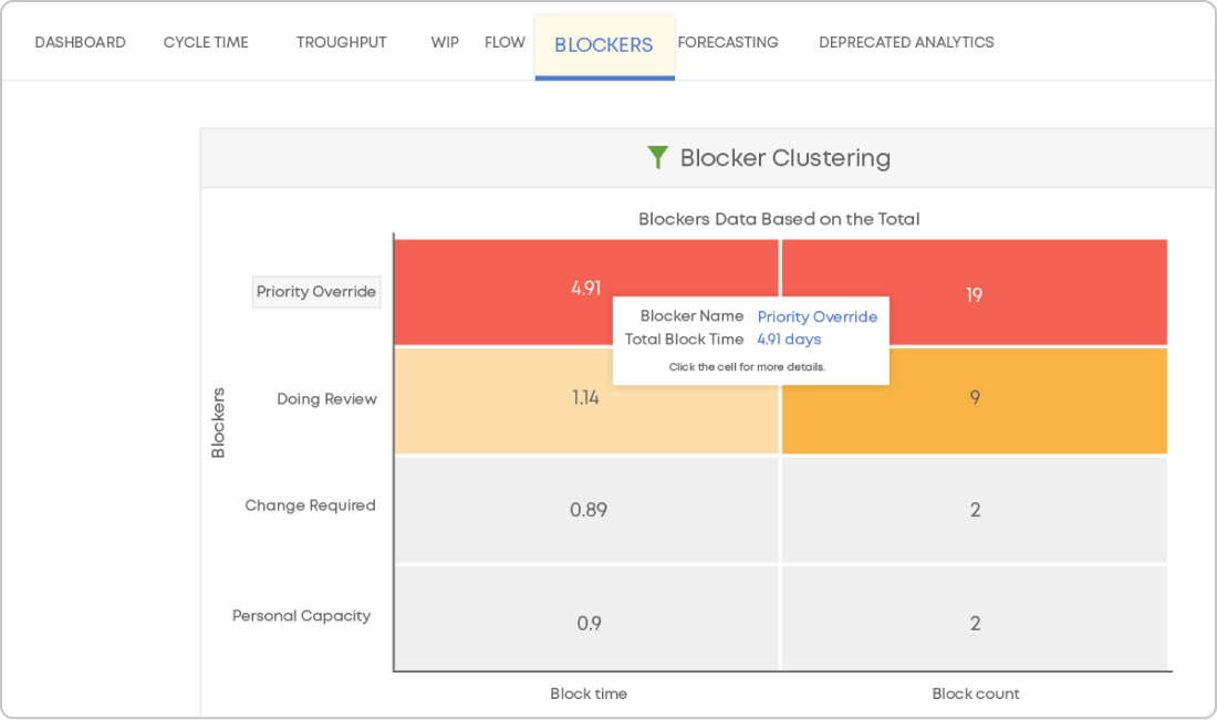 Visualizing the most prominent cause of blockage in a workflow using the Blocker Clustering chart in Businessmap