Key Takeaways
-
What is a scatter diagram? A scatter diagram is one of the simplest and most effective tools for spotting relationships between variables in quality management.
-
Scatter diagrams can reveal positive, negative, or no correlation - but they can't prove causation.
- In Lean and Six Sigma, scatter diagrams guide teams toward causes worth deeper investigation.
- Scatter diagrams are best used to test assumptions, forecast outcomes, and back decisions with data.
What Is a Scatter Diagram and How Does It Help with Quality?
A scatter diagram - also known as a scatter plot, XY chart, or correlation chart - is a simple but powerful way to visualize the relationship between two numerical variables. You plot one variable on the X-axis, the other on the Y-axis, and each point represents a pair of values. If there's a relationship, the points tend to align along a line or curve. The tighter they cluster around that line, the stronger the correlation.
In quality management, scatter diagrams are one of the seven basic quality tools used in root cause analysis. You can use them to quickly spot patterns that aren't obvious in spreadsheets. For example, a production team can suspect machine speed does not have a link to defect rates, but a scatter diagram can show otherwise: the faster the machine ran, the more defects appeared.
What Correlations Can Scatter Diagrams Reveal?
Scatter diagrams can show:
-
Positive correlation: as X increases, Y increases. Example: colder weather leading to higher hot drink sales.
-
Negative correlation: as X increases, Y decreases. Example: the longer a task's cycle time, the fewer tasks are completed.
-
No correlation: the data points are random with no visible pattern. Example: temperature changes having no effect on wooden chair sales.
The important thing to remember is that correlation does not imply causation. Just because two things move together doesn't mean one is causing the other. In Lean projects, we always combine scatter diagrams with further analysis before jumping to conclusions.
How Do You Interpret a Scatter Diagram?
Reading a scatter diagram is about spotting patterns in how the points are distributed across the chart. Start from the left and move to the right:
- If the points trend uphill, there's a positive correlation - as X increases, Y increases.
- If the points trend downhill, there's a negative correlation - as X increases, Y decreases.
- If the points are randomly scattered without a clear trend, there's no meaningful correlation.
The strength of the relationship comes from how tightly the points group around a straight line or curve. Closer points mean a stronger correlation; points spread far apart indicate a weaker one. In quality management and Lean problem-solving, interpreting this correctly can help you decide whether a suspected cause is truly worth investigating further.
How to Use a Scatter Diagram in Problem-Solving
Scatter diagrams are especially useful in root cause analysis. They help you see if a suspected cause and an observed effect are linked. In Six Sigma, they're used to test which causes have the strongest association with a problem so you can prioritize them.
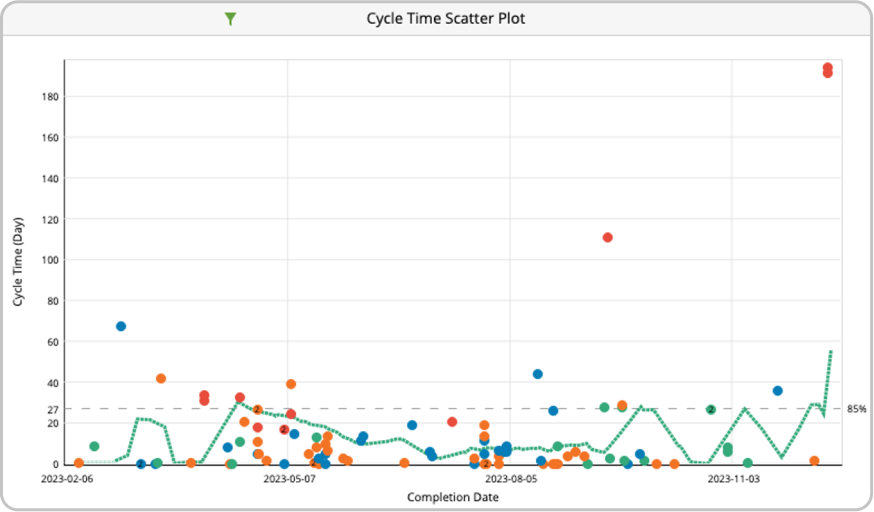
In Lean, an adapted version, the cycle time scatterplot, is used on Kanban boards. It plots completion dates against cycle times, giving teams probabilistic forecasts of how long new work might take. We use this to support our decisions with data-backed delivery dates rather than gut feel.
 Analyzing the correlation between number of defects and cycle time on a scatter diagram
Examples of a Scatter Diagram
One of the most practical uses of a scatter diagram in Lean management is the cycle time scatterplot for forecasting. At first glance, it may look complex, but it's a game-changer for predicting when work will be done.
Here's how it works:
- Imagine you've completed 100 tasks in 30 days.
- If 25 of those tasks were finished in 5 days or less, you can say you have a 25% chance of completing any future task within 5 days. On the scatterplot, you'd draw a horizontal line at the 5-day mark to indicate that percentile.
- If 50 tasks were completed within 10 days, you'd mark a 75% line at the 10-day point.
These percentile lines act like probability markers. So, when you commit to a deadline, you can look at your scatterplot and say, "We have a 75% chance of finishing within 10 days" or "a 25% chance of finishing within 5 days." It turns delivery estimates into informed, data-driven forecasts.
A cycle time scatter plot visualizing probability markers and the average cycle times trend line of a workflow in Businessmap
How to Create a Scatter Diagram Step-by-Step
Creating a scatter diagram starts with having paired data. Plot each pair on the coordinate system, label your axes, and, if possible, use colors or markers to differentiate subsets of data.
What Software Tools Support Scatter Diagram Creation?
If you want a quick start, online scatter diagram makers like Alcula, MathCracker, and RapidTables can generate simple charts by entering your data. They're fast, but limited in flexibility.
For more control and integration with your workflows:
-
Excel or Google Sheets for custom plots and trendlines.
-
Businessmap for scatterplots tied directly to work items and metrics in Lean/Agile contexts.
-
Power BI or Tableau for interactive dashboards.
Pro tip: In Businessmap, the cycle time scatterplot lets you filter, zoom, and overlay percentile lines to make delivery predictions - invaluable for teams.
The power of this last pro tip is clear in practice. When Flapper's engineering team adopted Businessmap, the cycle time scatterplot quickly became their predictive powerhouse. Instead of guessing completion dates, they used the built-in analytics to see exactly how long tasks took and how frequently. With percentile lines automatically calculated, they could commit to deadlines with confidence - "75% of tasks finish in under 10 days" became a data-backed promise. This transformed raw performance data into actionable insights, speeding up deliveries, reducing surprises, and putting the team in full control of their workflow.
»» Read the full Flapper Engineering case study
Benefits of Using a Scatter Diagram
- Quickly visualize possible relationships between variables
- Detect nonlinear patterns and trends
- Confirm or challenge assumptions with data
- Define data ranges and variability
- Track shifts in relationships over time
Common Challenges and How to Avoid Them
Two traps to watch out for:
-
Overplotting: too many points overlap, hiding patterns. Fix this by reducing data volume or using transparency.
-
Assuming causation from correlation: use scatter diagrams to inform hypotheses, not as final proof.
Correlation Types in Scatter Diagrams
| Correlation Type |
Pattern |
Example |
| Positive |
Points slope upward |
Higher advertising spend linked to higher sales |
| Negative |
Points slope downward |
More machine downtime linked to fewer units produced |
| None |
Random scatter |
Customer age unrelated to app login frequency |
Businessmap is the most flexible software
to achieve full work visibility across teams and portfolios
In Summary
A scatter diagram is a correlation chart that visually depicts the relationship between two variables. It provides insights into how two variables affect each other when they are plotted over a graph. Some of the benefits of scatter diagrams include:
- Visualization of the relationship between two variables.
- Visualization of patterns and trends that are easy to observe.
- Easy-to-use plotting mechanism.


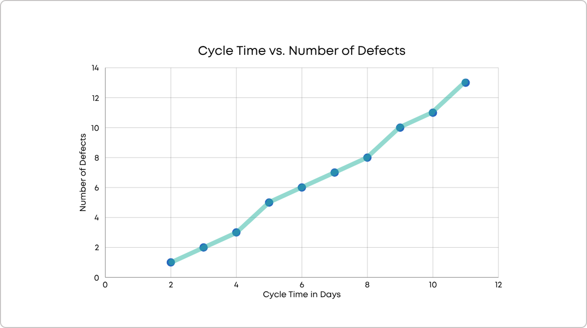 Analyzing the correlation between number of defects and cycle time on a scatter diagram
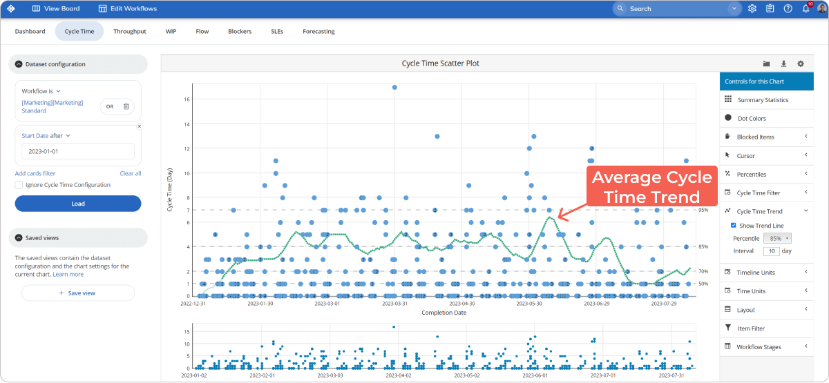 A cycle time scatter plot visualizing probability markers and the average cycle times trend line of a workflow in Businessmap