If you're dealing with any type of product or service delivery management, I bet you've heard of the term cycle time (and lead time). In Lean, this is one of the main metrics that can answer many questions related to process optimization.
However, measuring cycle time can be challenging because you need the right Lean/ Kanban charts in place. That's why, in the following paragraphs, we will present to you some of the most famous cycle time charts and explain how to read them.
The Cycle Time vs. Lead Time Question
Before we move forward, let's make clear the difference between cycle time and lead time.
There are many definitions all over the internet, but ours is pretty simple. Cycle time is the time you need to complete something you've already started working on. Lead time, on the other hand, is the overall time between a customer request and the final delivery.
If we take an online store as an example, the lead time is the period between the placement of the order and its final delivery. Meanwhile, the cycle time starts counting whenever you begin working on the order (packaging the product, shipping, etc.).
In reality, this entire process can be visualized on a digital work management tool. With the proper analytics and based on the configurations you set, you can turn a cycle time into a lead time chart and vice versa.
So, without further ado, let's look at the 3 cycle time charts below. To make this read more enjoyable, we will focus on some questions that they help you answer.
When Can We Deliver X? (Cycle Time Scatter Plot)
The cycle time scatter plot is one of the most helpful tools in every project/delivery manager's arsenal. And for a good reason.
At first look, this cycle time chart might seem scary, but it's not. In a nutshell, all the blue dots represent completed work in your process on a given date. Looking horizontally at the chart, you will see that every blue dot corresponds to a number on the left side and a percentage on the right side. And that's where the beauty of the scatter plot lies.
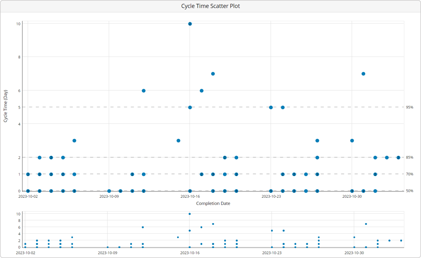
While the number on the left tells you what's the historical cycle time of different work items (in days, hours, etc.), the percentiles on the right represent the probability of delivering future individual work within that timeframe.
For example, if the 50th percentile corresponds to 2 days, it means it took you 2 days or less to deliver half of your work. As managers, however, we want to account for risks and increased uncertainty, so let's take a look at the 85th percentile.
Following the same logic, if it aligns with 6 days, you can say there is an 85% chance of completing work within 6 or fewer days.
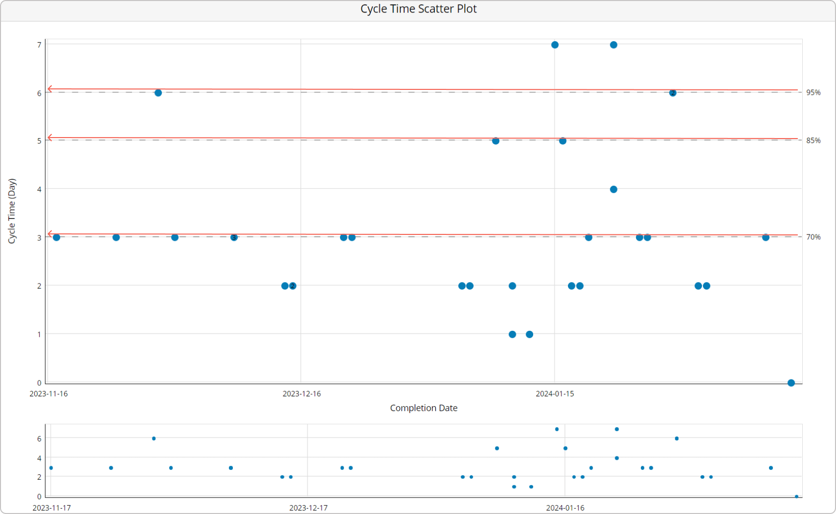
By now, I am sure you see how this information can be pretty valuable. Using it, you can communicate SLEs (service level expectations) with your customer (internal or external) when a specific work item will be done.
And while that's a great insight on its own, the benefits of the scatter plot don't end here. As the chart is one big representation of completed work in your process, you can use trend lines to determine whether your cycle time increases or decreases over time.
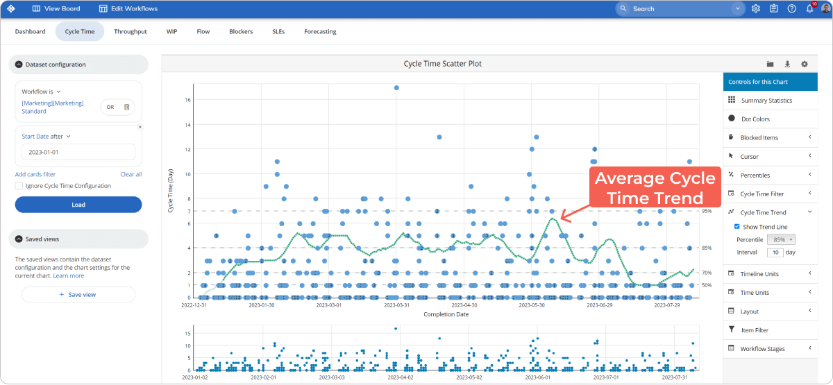
The accumulation of completed work also allows you to spot outliers. You will locate them by looking at the blue dots above the percentile lines. Remember that if you reduce the outliers in your process, you will decrease your overall cycle time and eventually achieve greater process predictability.
Where Is the Bottleneck? (Cycle Time Heat Map)
One of the biggest drivers of process unpredictability is bottlenecks. In short, they are those stages in the workflow that slow down the entire process. Bottlenecks are one of the main reasons for long cycle times, work delays, and, eventually, unhappy customers.
So, it's safe to say that if you ignore them, they can cause a lot of harm. Fortunately, one cycle time chart comes to the rescue - the Cycle time heatmap. You can use it to spot how long work items spent in different areas of your process and spot bottlenecks. Let's see how it works.
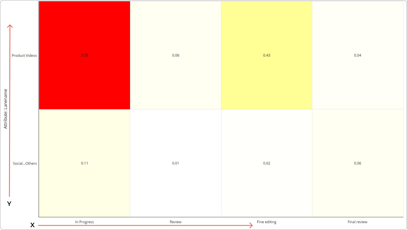
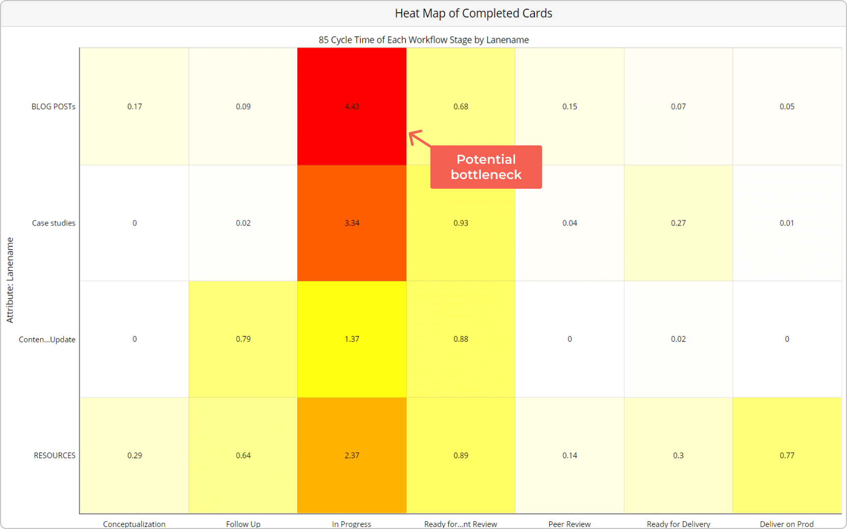
In Businessmap, the heat map visualizes completed work based on 2 categories. The x-axis separates the work considering the columns of your kanban board. Meanwhile, on the y-axis, you can choose another attribute to narrow down your data. One of the most widespread cases is to use the heat map to understand where work remained in the process the longest based on work stages (vertical columns such as "In Progress", "Ready for Review", etc.) and horizontal lanes (ex., work categories such as Social Media Content, Product Videos, etc.).
Inside the boxes of the heat map, you will see the cycle time for each stage in the process. Pay attention to those stages, which are colored in red because they signify where work items accumulate the highest cycle time. If you find that work remains in some of them significantly longer than others, that signals a potential bottleneck. Therefore, you can now dig deeper into its causes and determine how you could improve the flow of work.
How to Measure Predictability? (Cycle Time Histogram)
The cycle time histogram is almost the same as the scatter plot. However, it visualizes data differently. The chart allows you to determine better how predictable you become over time.
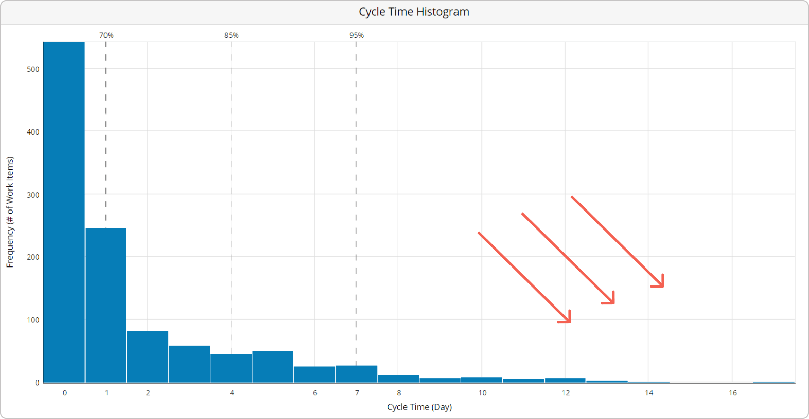
So, unlike the scatter plot, this cycle time chart gives you a high-level overview of your cycle time's distribution over a certain period. The x-axis visualizes how the cycle time is dispersed in your process, while the y-axis shows you the number of work items you've been able to complete. Looking at the vertical bars, you can tell by their height the most frequent cycle time occurrence in your process.
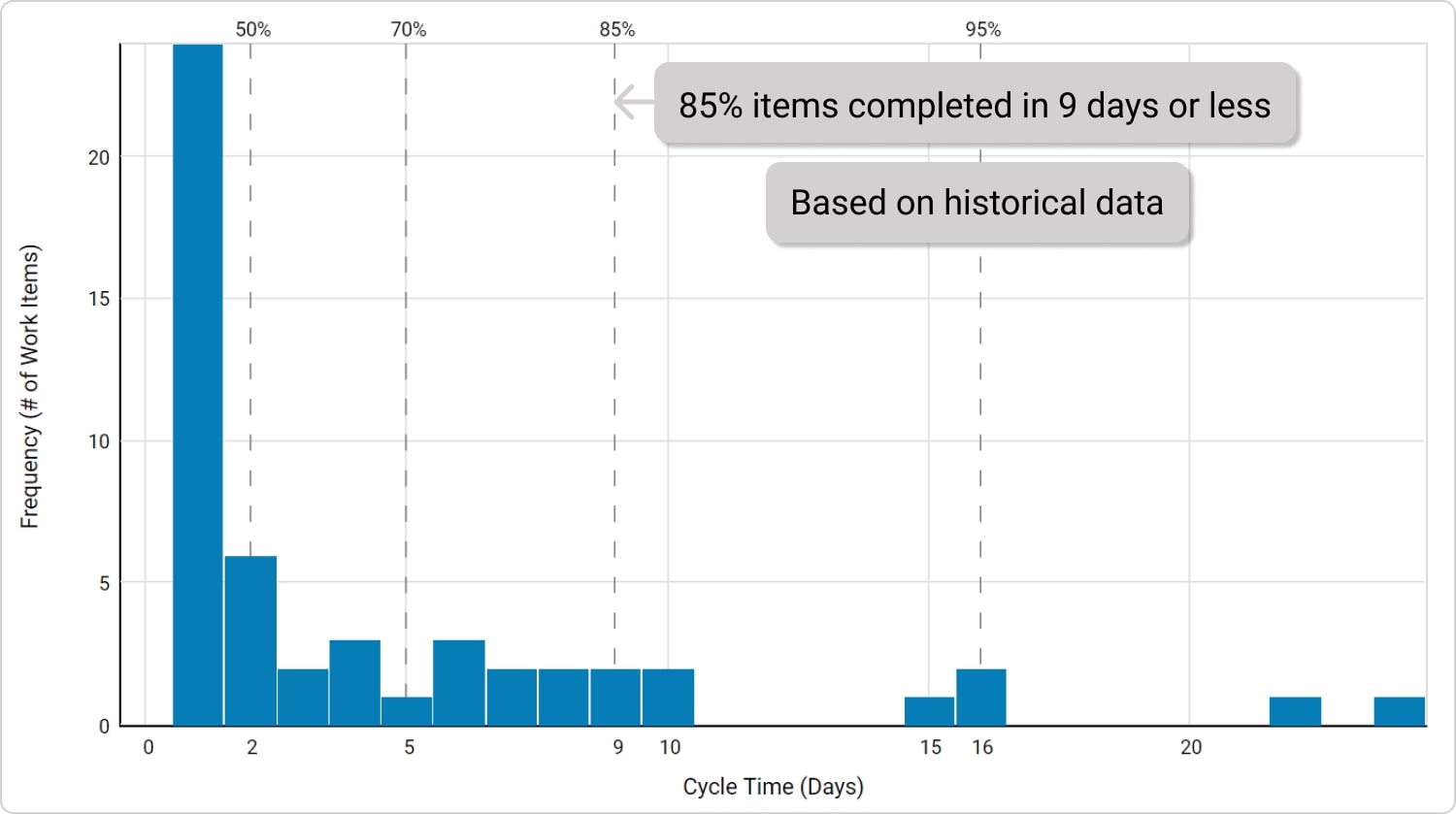
However, that's one part of the story. The other lies above the vertical bars, where percentiles communicate different levels of predictability. For example, if the 85th percentile corresponds to 9 days, you can say that 85% of your work in a given period was completed anywhere between 1 and 9 days. This is a great insight when planning a specific type of work in the future.
To measure how predictable you are, keep an eye on the "tail" on the right side of the histogram. If a lot of your work items have a wide cycle time dispersion (for example, they can finish anywhere between 2 and 20 days), your process is obviously not very predictable. So, as a rule of thumb, the more you shorten the "tail" of your cycle time distribution, the more predictable you will become over time.
How to Get Started with Cycle Time Charts?
As you can see, having a way to measure cycle time can answer some valuable questions for any project/delivery manager. So, how can you get started with them?
Our advice is first to map your process on a visual board and start gathering some historical workflow data. Once you have it, the charts discussed above will help you continuously optimize your processes to satisfy your customers with more predictable value delivery.

Dimitar Karaivanov
CEO and Co-founder of Businessmap
Dimitar is a lean thinker and a Kanban practitioner with a solid background in the areas of software development and process improvement. He is passionate about achieving extreme performance at scale and applying Lean/Agile principles outside IT.


